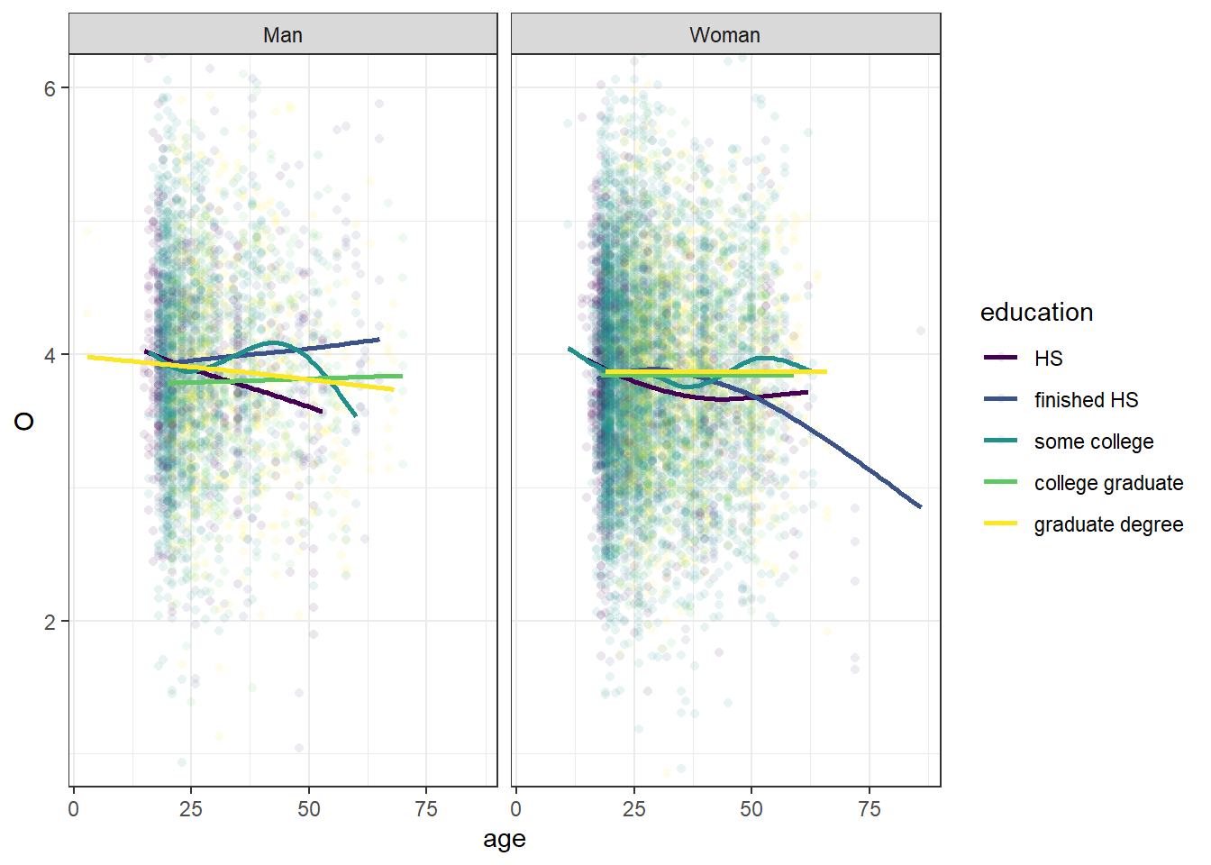
library(ggplot2)theme_set(theme_bw())base_plot <-ggplot(bfi, aes(age, O, color = education)) +facet_wrap(facets =vars(gender)) +coord_cartesian(ylim =c(1, 6)) +scale_color_viridis_d()base_plot +geom_point(shape =16, alpha =0.1) +geom_smooth(se =FALSE)
This is a busy plot. It’s hard to see what the each prediction line is doing because there are so many of them, and it’s hard to make out the scatter plot behind the lines due to there being so many dots.
We might be tempted to pre-process some data in some way and pass it to each layer via the data= argument in geom_point/smooth. However, that gets ugly fast (did I clean the outliers in all the datasets for this plot?).
Instead, we can take advantage of the fact that the data= argument can take a function to pre-process that plot data before plotting:
A function will be called with a single argument, the plot data. The return value must be a data.frame, and will be used as the layer data. A function can be created from a formula (e.g. ~ head(.x, 10)).
Let’s look at two examples.
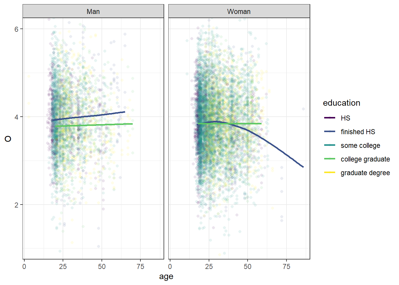
1. Only Some of the Smooths
For example, we can pass a filtering function (here as a formula) to only get the prediction lines of two categories.
library(dplyr) base_plot +geom_point(shape =16, alpha =0.1) +geom_smooth(se =FALSE,# looking only at HS vs collage graduatesdata =~filter(.x, education %in%c("finished HS", "college graduate")) )
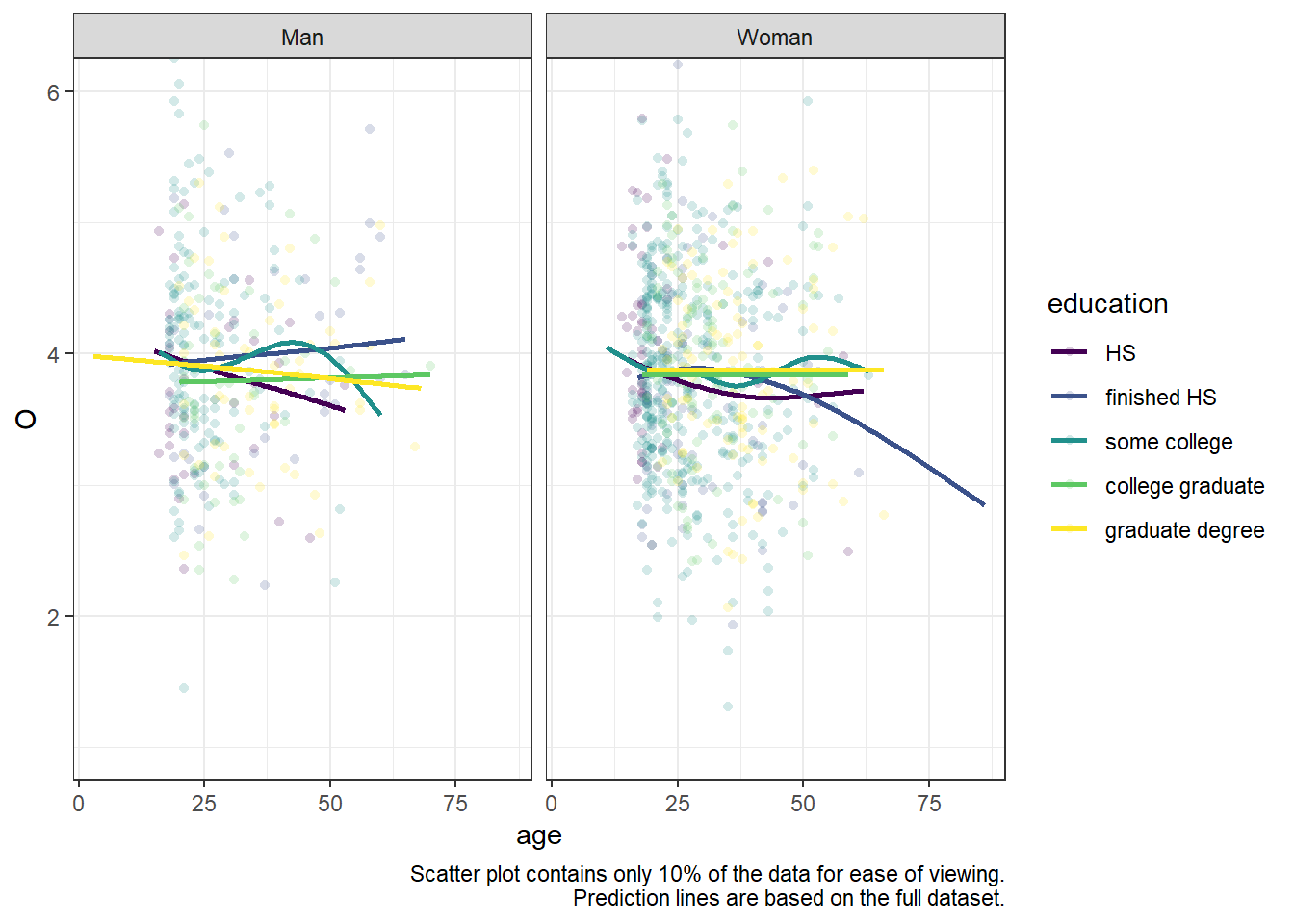
2. Only Some of the Points
We can also randomly select some points (note that the prediction lines are still based on the full dataset).
base_plot +geom_point(shape =16, alpha =0.2,# sample 10% from each group of `education`+`gender`data =~group_by(.x, education, gender) %>%sample_frac(0.1) ) +geom_smooth(se =FALSE) +# Let the reader know what you've donelabs(caption ="Scatter plot contains only 10% of the data for ease of viewing. Prediction lines are based on the full dataset.")
You might also be interested in gghighlight for plotting all of the data, but highlighting only some of it.